一些关于CSS的tip
margin 值的百分比是相对于父元素的 width 。- 三角形的制作利用
width height 为0 然后设置 border 。
- 气泡的制作
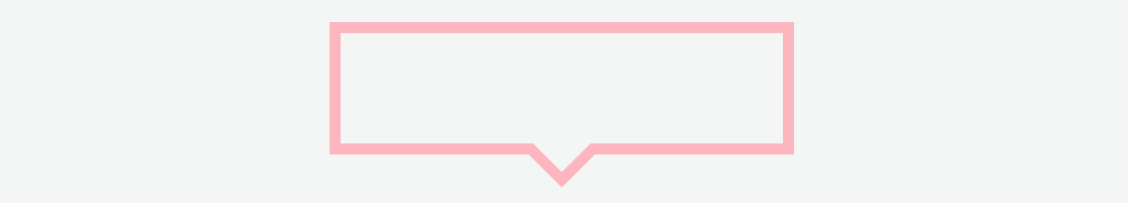
<div class="bubble">
<div class="triangle common"></div>
<div class="cover common"></div>
</div>
.bubble {
width: 200px;
height: 50px;
border: 5px solid #FFB5BF;
position: relative;
}
.common {
width: 0;
height: 0;
position: absolute;
left: 50%;
transform: translate(-50%, 0);
}
.triangle {
bottom: -20px;
border-top: 20px solid #FFB5BF;
border-right: 20px solid transparent;
border-left: 20px solid transparent;
}
.cover {
bottom: -13px;
border-top: 20px solid #94E8FF;
border-right: 20px solid transparent;
border-left: 20px solid transparent;
}
loading 效果制作利用 CSS3 的动画<div class="loading"></div>
.loading {
width: 50px;
height: 50px;
display: inline-block;
border: 5px solid #ddd;
border-left-color: #FFB5BF;
border-radius: 50%;
}
.loading {
animation: loading-animation 1.2s linear infinite;
}
@keyframes loading-animation {
0% {
  transform: rotate(0deg);
}
100% {
  transform: rotate(360deg);
}
}
- 行级元素的高度取决于文体字体大小。
- 文字隐藏的方法:
height: 0+padding撑出背景图片,然后设置overflow: hiddentext-indent: -10000- 将文字包入
span元素中,然后display: none
a 标签的样式需要遵守 link visited hover active 顺序,在 href 不填入值的时候, a:link 不起作用。- 浏览器将标签间的换行空白渲染为一个空格导致部分元素间出现间隙解决方法:
- div里嵌套了
img 底部会出现白边
- 因为
img 默认是按基线 (baseline) 对齐的。
- 要去掉空格可以使用
vertical-align: bottom 或将 img 标签变为块级元素。